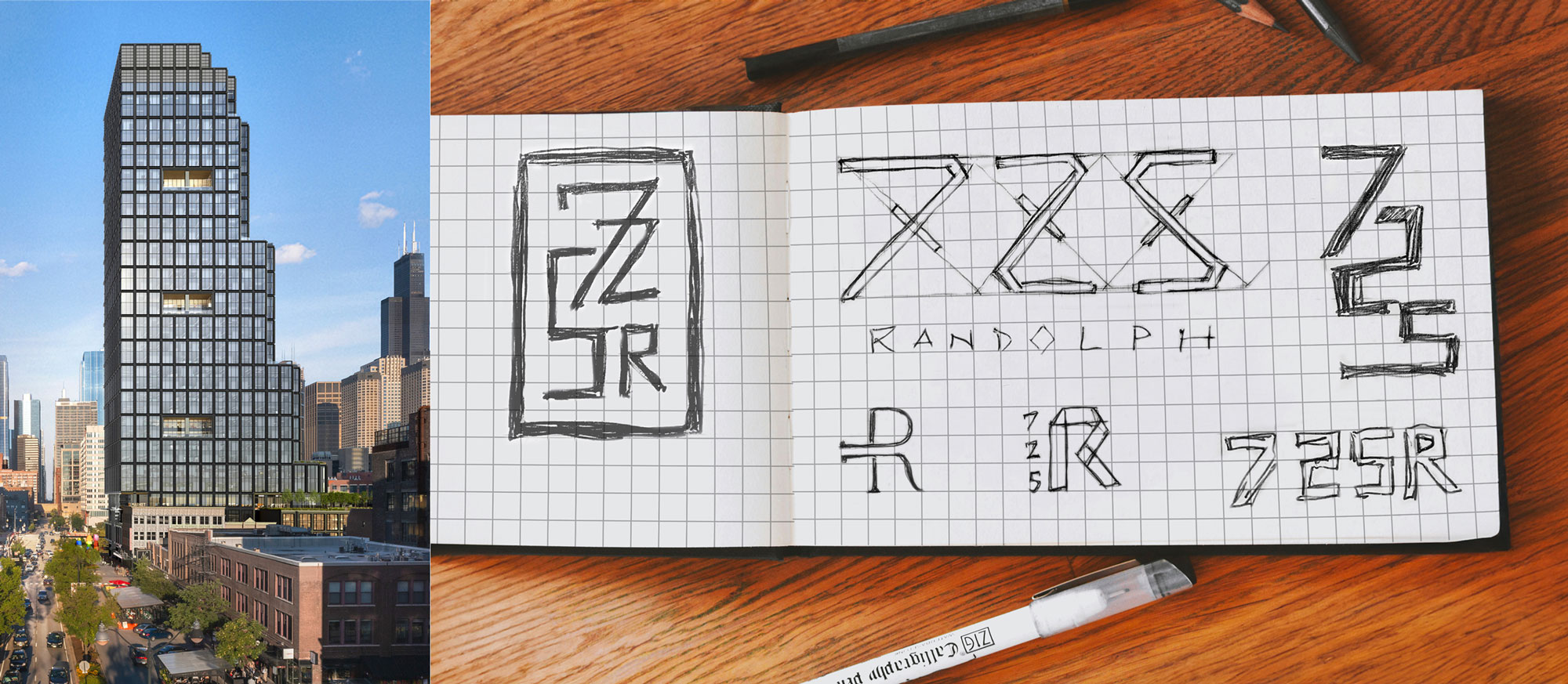
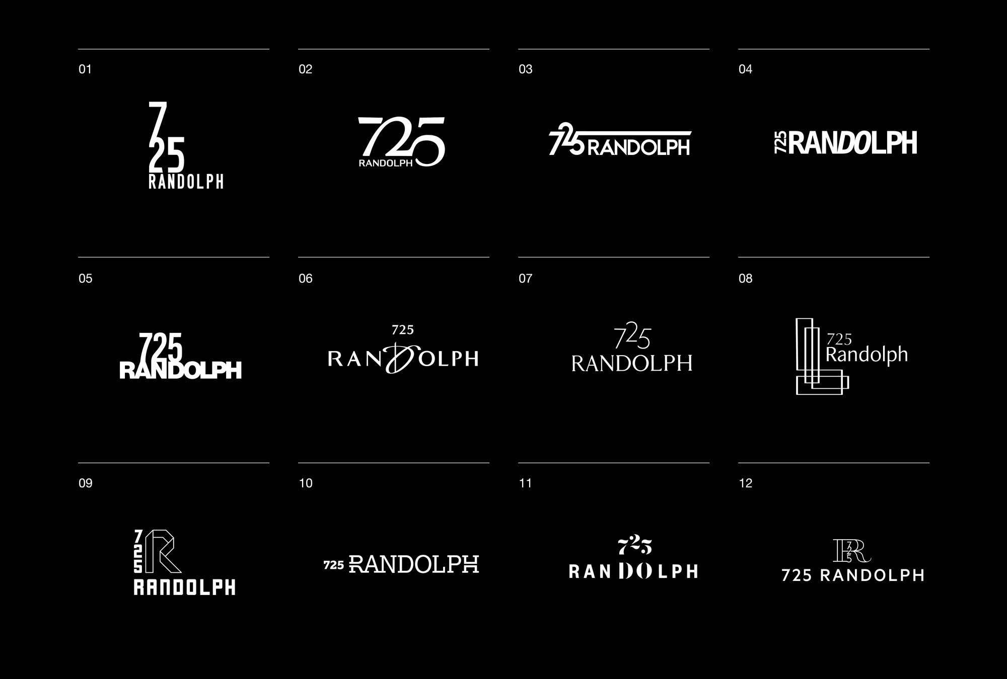
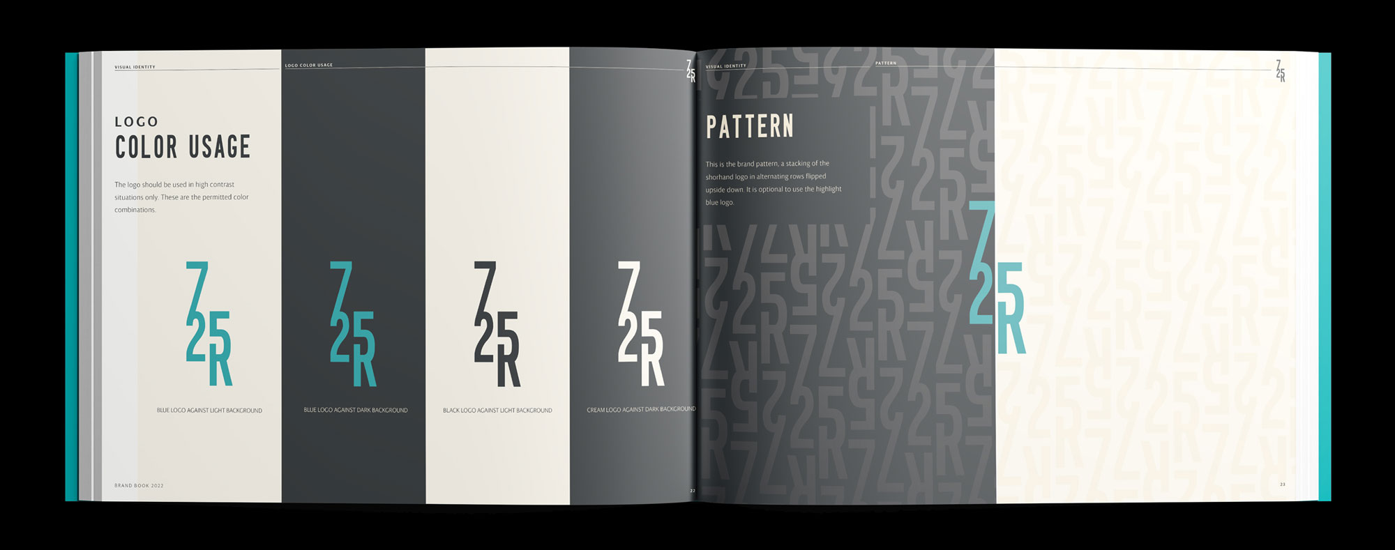
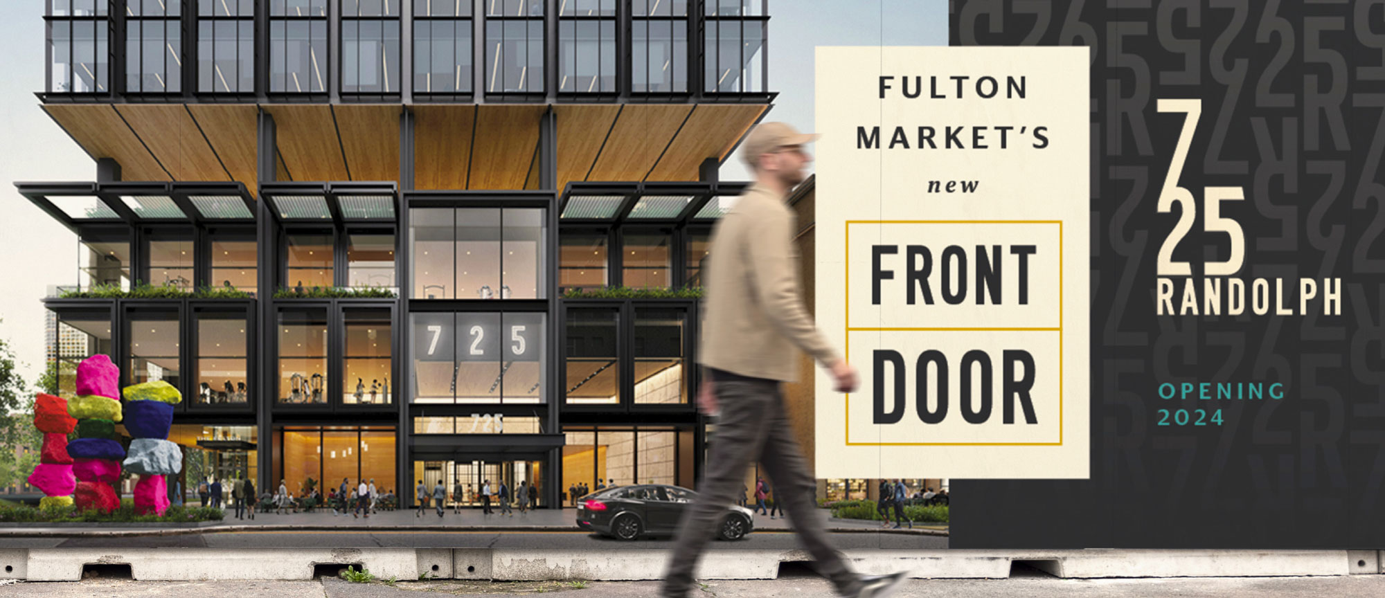
725 Randolph sits in the heart of Chicago’s Fulton Market district, positioned as the area’s “new front door.” Developed to channel the energy of the neighborhood while addressing the challenges of growth and congestion, the building was framed as a gateway that offered both convenience and connection.
725 Randolph - sketch
Designing with the numbers 7-2-5 meant treating them as shapes instead of symbols, balancing structure with movement.
725 Randolph logo grid
logo 725 Randolph door logo
logo - 725 Randolph - bag
logo - 725 Randolph - paper
logo 725 Randolph metal
Eventually a vertical mark was imagined with Randolph as its base, grounding the identity in a street central to Chicago.
725 Randolph logo white
725 Randolph logomark
725 randolph brand guide
The final logo reflects the building’s setbacks and terraces, with industrial letterforms that nod to the neighborhood’s grit. A lifestyle-driven palette and flexible patterns position it as Chicago’s only true lifestyle office building.
725 randolph web
725 randolph bag
725 randolph phone
725 randolph bag
725 randolph phone
725 randolph phone